Banking App Redesign
The app already offered a broad range of banking features, but first-time use and everyday tasks felt fragmented. I redesigned the experience to make navigation more predictable, repeated actions more consistent and important financial journeys easier to complete with confidence.
On this page
The Project in Three Parts
Challenge: Customers could access the features they needed, but inconsistent navigation and interaction patterns made the app difficult to learn and easy to mistrust.
Design response: I simplified the navigation hierarchy, standardised related tasks and embedded WCAG 2.2 AA accessibility requirements across the redesigned journeys.
Outcome: Testing showed faster completion, fewer navigation errors and fewer steps across first-time and everyday banking tasks.
The Features Existed, but the Experience Did Not Feel Coherent
The app supported balances, payments, transfers and card management, but customers had to navigate different structures and interaction patterns to complete closely related tasks. The feature set was comprehensive; the route through it was not.
The greatest friction appeared during first-time use and high-frequency actions such as logging in, linking accounts, checking balances and moving money. The recurring problems were:
- Unclear navigation structure: important tasks buried under secondary menus
- Inconsistent design patterns: different screens required users to relearn interactions
- Accessibility gaps: low colour contrast and small tap targets made the app harder to use for customers with visual or motor impairments
- Inefficient flows: everyday actions like transferring money or managing cards required more taps than necessary
For a banking product, this inconsistency affected more than speed. When customers could not predict where an action lived, what would happen next or how to recover from an error, the experience weakened confidence at the point where trust mattered most.
What the Evidence Revealed
I combined customer feedback supplied by the bank with a heuristic evaluation, a WCAG 2.2 AA accessibility review and journey mapping across login, account linking, transfers and card management.
- Customer feedback
- Heuristic evaluation
- WCAG 2.2 AA review
- Journey mapping
Key Insights
Navigation Overload
Payments, transfers and card settings were distributed across different menus, leaving customers uncertain about where an everyday task should begin.
Inconsistent Patterns
Related actions used different layouts, labels and sequences, so learning one flow did not help customers complete the next.
Accessibility Gaps
Low contrast, small touch targets and weak error feedback made already sensitive financial actions harder to complete and recover from.
Cognitive Load During Onboarding
New customers encountered too many choices before understanding the app’s essential structure and most important early actions.
Together, the evidence showed that the central problem was consistency. Customers could often complete an individual task, but they could not reliably predict where similar tasks would be found or how those interactions would behave.
User Flow Mapping
I mapped the complete navigation to expose redundant steps and unclear relationships between features. The revised hierarchy prioritised common banking actions and created clearer routes between accounts, payments, transfers and card management.

Turning the Findings Into a Consistent System
As the sole designer, I translated the research into a clearer information architecture and a reusable interaction system. The work moved from evaluating the existing product to mapping journeys, simplifying navigation, standardising patterns and testing the revised flows.
Research
Heuristic evaluation and accessibility review
Analysis
Customer evidence and journey mapping
Design
Navigation hierarchy and reusable patterns
Test
Usability testing and refinement
Launch
Accessible release and developer handoff
Key Principles
Streamline Navigation
Payments, transfers and card controls were grouped around customer intent, with high-frequency actions surfaced earlier and secondary features placed within a clearer supporting structure.
Unify Interaction Patterns
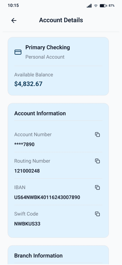
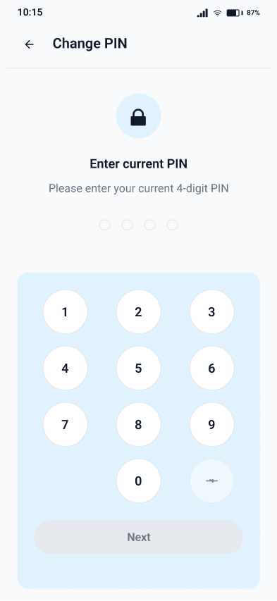
Card settings, PIN changes and account actions adopted common layouts, labels, feedback and confirmation patterns so customers could transfer knowledge between tasks.
Embed Accessibility
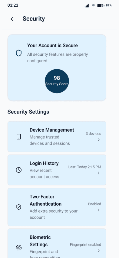
Contrast, touch targets, labels and error states were improved as part of the core interaction design rather than treated as a separate compliance exercise.
Guide Early Use (Onboarding)
First-time login and account linking were shortened and staged so customers could understand the essential actions before encountering the wider feature set.
Wireframes
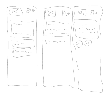
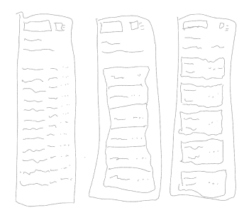
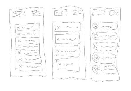
Low-fidelity wireframes were used to compare navigation structures and test information hierarchy before visual detail was introduced. The sequence shows the progression from early exploration to a more coherent task structure.
How the Redesigned Experience Solved the Core Problems
Home and Navigation
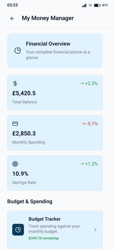
Before: Everyday actions were spread across multiple menus, forcing customers to remember the product structure before they could use it.
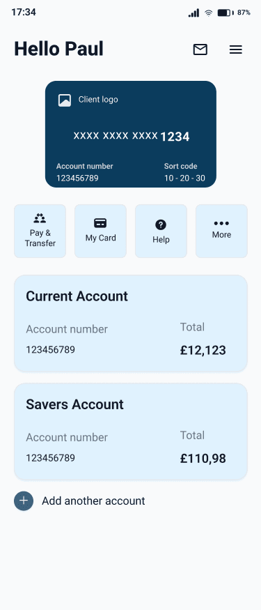
Design response: The home screen now prioritises balances and frequently used actions, while the secondary menu provides a predictable route to the broader feature set.
Customers reached common destinations in fewer taps because the information hierarchy reflected task frequency rather than the internal product structure.

Payments and Transfers
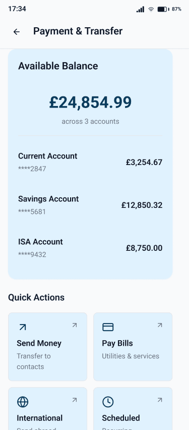
Before: Payments and transfers appeared in different areas and used different starting points, increasing hesitation during money movement.
Design response: A unified flow brings related money-movement actions into one consistent structure with clearer progression and feedback.
The redesigned journey reduced errors and made the sequence of entering, reviewing and confirming a transfer easier to understand.
Card Management
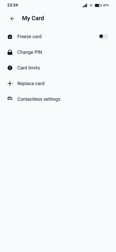
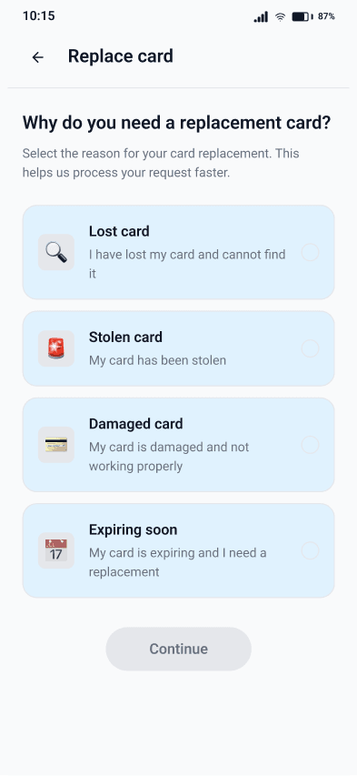
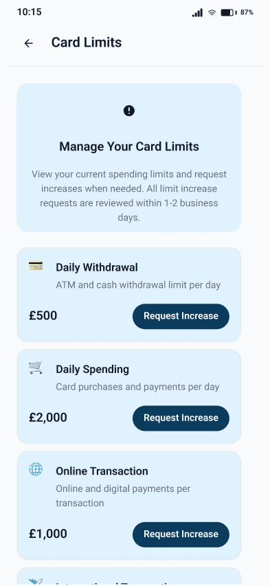
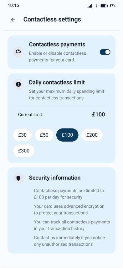
Before: PIN changes, card limits, contactless controls and replacement were buried within separate and inconsistent routes.
Design response: The My Card area centralises these controls and applies the same hierarchy, language and confirmation behaviour across each task.
Customers could apply knowledge from one card action to the next, reducing navigation errors and improving confidence in self-service controls.
Headline Results
Usability testing across selected journeys showed that the redesigned structure helped customers complete first-time setup and everyday banking actions more efficiently, while reducing navigation errors and improving recovery when something went wrong.
What Improved
The redesigned journeys produced measurable improvements in speed, error reduction and interaction efficiency:
- Faster completion: First-time login, account linking and selected everyday tasks were completed more quickly during testing.
- Fewer errors: Clearer navigation, consistent patterns and stronger feedback reduced failed actions and unnecessary recovery.
- Simpler interactions: Common tasks required fewer steps because related actions were grouped and high-frequency features were surfaced earlier.
- More accessible journeys: Key screens and flows were brought in line with WCAG 2.2 AA requirements, improving readability, touch accuracy and feedback.
The broader outcome was a more predictable product. Customers could reuse what they learned from one journey in the next, understand the current state and recover from mistakes without losing confidence.
What the Redesign Reinforced
The project reinforced that a banking experience is judged not only by what customers can do, but by how confidently they can predict, complete and recover from important actions.
Navigation Shapes Trust
Customers feel more secure when the location and behaviour of important financial actions remain predictable.
Consistency Reduces Relearning
Standardised structures allow knowledge from one task to support the next, reducing both time and cognitive effort.
Accessibility Strengthens the Core Product
Improved contrast, labels, target sizes and feedback benefited the full customer base rather than only users with declared access needs.
Small Friction Compounds Across Frequent Tasks
A small number of unnecessary steps or unclear states becomes significant when customers repeat those actions throughout the life of the product.
By connecting the research, navigation model, interaction patterns and accessibility work, the redesign created a clearer experience without changing the breadth of banking services available to customers.