On this page
01 · Overview
Project at a glance
Overview
Volopa provides business payment cards and multi-currency spending tools. For employees and cardholders, the mobile app is where they check a card, understand their balance, review transactions, attach receipts and find help when they need it.
This project focused on improving the experience of the existing iOS and Android app. The aim was not to introduce a new set of features. It was to make the core functionality clearer and reduce the effort required to complete everyday tasks.
The redesign brought the selected card into focus, made navigation more accessible, reduced unnecessary steps around receipt uploads and made the transactions and Help areas easier to understand.
02 · The challenge
Improving clarity without rebuilding the product
The existing app supported the tasks people needed to complete, but its layout and interaction patterns made some of those tasks less direct than they should be.
Navigation relied on a drawer, meaning users had to open a menu before moving to another main area. Card details, available balance and actions were not presented as one coherent part of the dashboard. Attaching a receipt meant going into a transaction and finding the attachment action further down the detail page. Transaction lists repeated information that could be handled more clearly through grouping. Help content was also harder to scan than it needed to be.
These were usability and information-hierarchy problems, rather than a requirement for a wholesale product rebuild.
The design challenge was to improve clarity, navigation and task flow while keeping the existing business functionality intact.
03 · Research & role
Understanding the existing experience
I reviewed the original mobile screens and the key journeys cardholders needed to complete. I also worked from feedback available through onboarding, client discussions and internal product knowledge, and reviewed relevant patterns from fintech and other mobile products.
The review focused on where users needed additional navigation steps, where important information competed for attention, and where actions were separated from the content they related to. I also used WCAG 2.2 guidance and relevant accessibility/interaction patterns as design references.
Evidence boundary: This was not a formal quantitative study, and I do not have reliable baseline task-time or error-rate figures to attribute to the redesign.
My role and collaboration
I was responsible for taking the UX/UI work from review and early ideas through flows, lower-fidelity layouts, detailed UI, prototype and developer handoff. I worked with Harry and Ringo for product and domain understanding, with Tom as the team manager and final decision-maker, and with development stakeholders to keep the solutions practical.
The process involved discussing design choices, reviewing prototype screens and responding to feedback. The objective was to improve the real tasks in the app, rather than make a cosmetic change that introduced unnecessary complexity.
04 · Design approach
Working from friction points, not a feature wish list
I worked from the current experience, identified repeated friction points and developed alternative layouts around the existing workflows. Where possible, I reused and adapted components and patterns from the established web design system instead of introducing unfamiliar controls.
The main design decisions were navigation, the card-focused dashboard, card selection, receipt attachment, transaction presentation, transaction detail actions and Help. Each change was intended to make the relationship between information and action easier to understand.
Reduce the steps needed to move between core areas.
Connect card information, balance and actions in one context.
Place receipt and expense actions where people encounter the transaction.
Adapt the existing product system to mobile instead of creating a disconnected interface.
05 · Navigation & dashboard
Making navigation more direct
BeforeThe main sections were accessed through a navigation drawer. Reaching another part of the app required opening that drawer first.
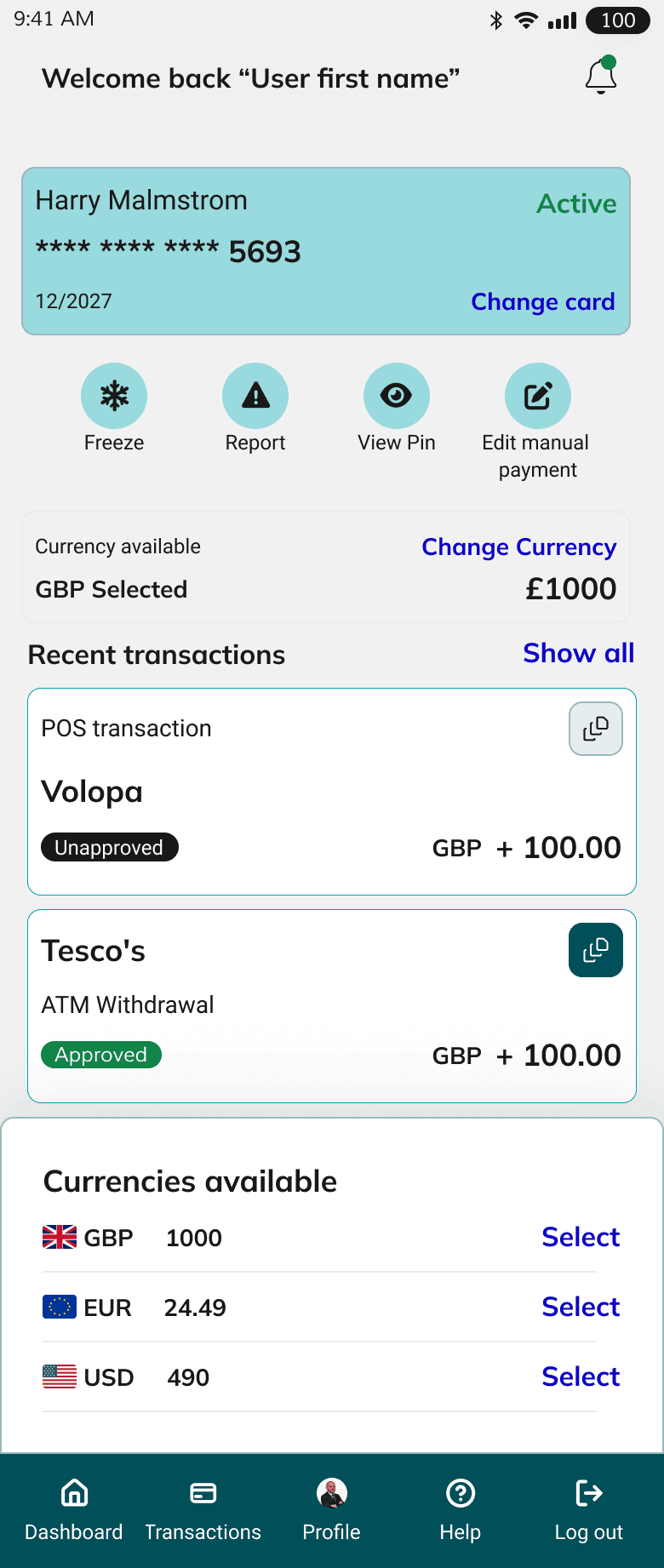
AfterI replaced that pattern with a persistent bottom navigation containing five destinations: Dashboard, Transactions, Profile, Help and Log out.
This made the available destinations visible and removed an extra step from moving between the app’s main areas. The result was a simpler, more predictable navigation pattern for the core mobile journeys.
Reorganising the dashboard around the selected card
The earlier dashboard contained the relevant information, but the card, balance and available actions felt disconnected.
I redesigned the dashboard so the selected card provides the organising context. I removed the redundant Card holder name label, moved the card actions directly below the card, and gave the selected card’s balance clearer prominence. The Show all control opens a modal to reveal the available currency balances without crowding the main dashboard.
The hierarchy now makes it easier to understand which card the information relates to and what can be done with that card.
Making it easier to change cards
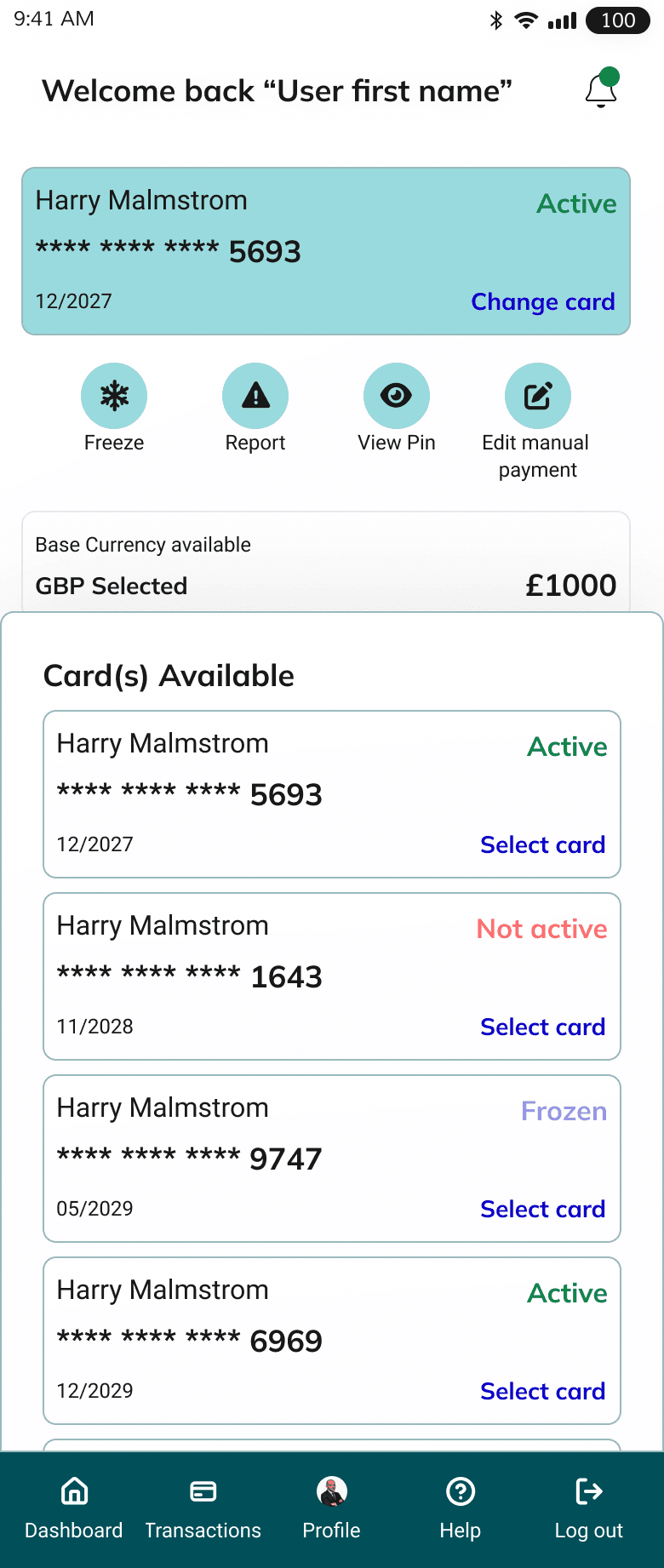
A cardholder may need to move between different cards. The redesign makes Change card a clear action and uses a bottom sheet for card selection, keeping the choice within the current dashboard context.
The purpose was to avoid making card selection feel like a separate journey. Once a card is selected, its related information and actions become the focus of the dashboard.
06 · Transactions
Bringing receipt attachment closer to transactions
Receipt submission is an important part of expense management. Previously, a user had to open the transaction detail and scroll to find the attachment option.
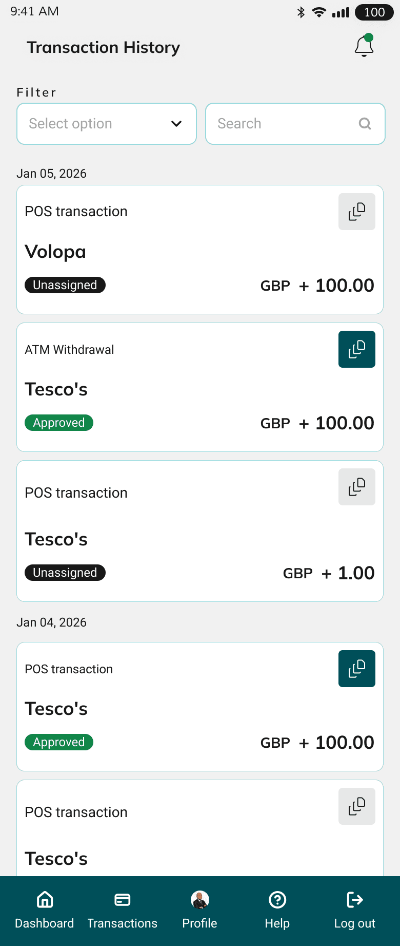
I proposed placing the receipt attachment action directly on the transaction card, both in the dashboard’s recent transactions and in the full Transactions list. From there, users can attach an existing document or use the camera.
This shortens the route to a frequent task and places the action next to the transaction it belongs to. The proposal was positively received by the team.
Simplifying the transaction list
I reworked the transaction list to improve scanning. Instead of repeating the date within every transaction, transactions are grouped under date headings.
This reduces repeated information and makes the list easier to read as a chronological record. The receipt action also remains available at transaction level, rather than forcing the user to open the full transaction details for that task.

Clarifying actions in transaction details
Transaction details need to distinguish between editing expense information and progressing a transaction through an approval process.
In the redesign, Save and Cancel sit within the Expense Details section and remain disabled until the user changes something. Back and Submit for approval are kept separate from those edit-specific controls.
Separating the actions in this way makes their purpose clearer and reduces the chance that a user confuses saving an edit with submitting something for approval.
07 · Help & system
Making Help easier to use
The previous Help experience could be simplified by putting common questions into one more coherent place.
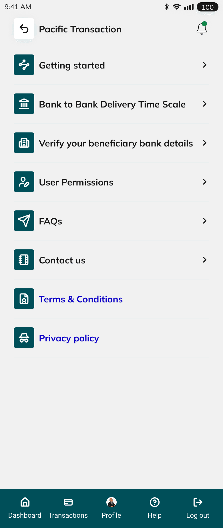
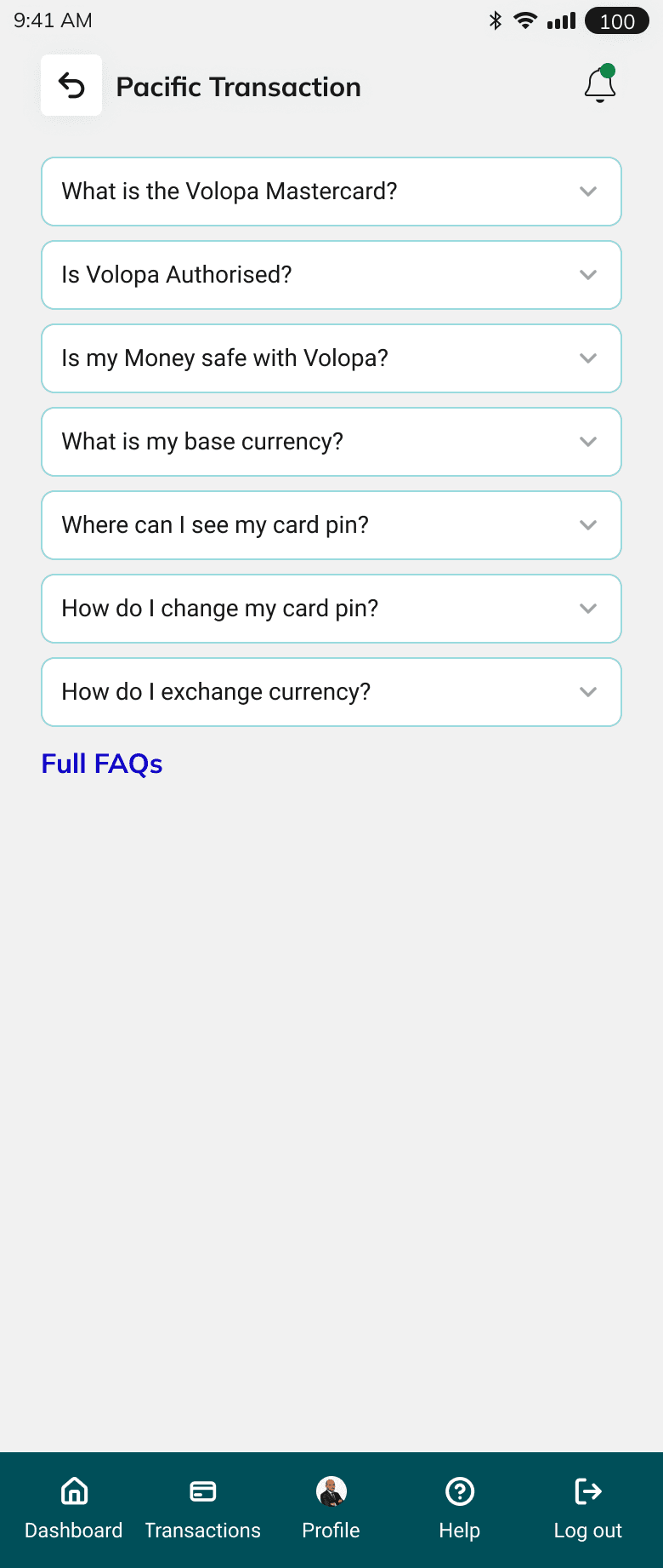
I consolidated frequently asked questions into a clear Help view using an accordion-style interaction, with one answer expanded at a time. This lets a user focus on the answer they need without being presented with several long sections at once.
A More Frequently Asked Questions link remains at the bottom for access to the wider FAQ content on the website.
Design system and accessibility
The visual direction built on the existing web product design system, adapting patterns to mobile rather than creating a disconnected set of components. The design and handoff considered hierarchy, readable content, recognisable actions, touch interactions and accessible states, using WCAG 2.2 and relevant ARIA guidance as references.
These are design considerations and documentation, not a claim that the app has independently passed a formal accessibility audit or achieved a particular conformance level.
08 · Collaboration & handoff
Balancing product constraints with a clearer structure
Collaboration and trade-offs
Not every recommendation was taken forward exactly as proposed. I recommended placing Needs more information within Transactions because it relates to transaction follow-up, but Tom preferred to retain it on the dashboard. That decision was reflected in the final direction.
The process required balancing a cleaner information architecture with stakeholder priorities and the existing product constraints. The direct receipt-upload action, card selection changes and Help improvements received positive feedback during prototype reviews.
Prototyping and developer handoff
I developed and reviewed the flows and interfaces through a working prototype. As part of that process, code generated with Codex was brought into Figma Make, and the development team could access the Figma designs through MCP for implementation reference.
The handoff focused on communicating the intended structure and behaviours, not just static screens: what changes when a card is selected, where receipt attachment starts, when expense-edit actions become available and how the Help accordion should behave.
09 · Outcome
A more coherent direction for the existing app
The redesign provides a more coherent direction for the existing Volopa app: clearer primary navigation, a more focused dashboard, more direct card selection and receipt attachment, easier-to-scan transactions and a simpler Help experience.
The prototype received positive qualitative feedback from internal stakeholders and a major client, particularly around receipts, switching cards and Help. The redesign is currently in development, so there are no production analytics or post-launch performance results to report. The benefits described here are design goals and prototype feedback, not measured improvements after launch.
Qualitative prototype feedback is available; production performance data is not.
10 · What I learned
Reducing friction can be more valuable than adding features
This project reinforced that improving a complex fintech product does not always mean adding functionality. Sometimes the most valuable work is reducing friction in the journeys that already exist, strengthening hierarchy and keeping actions close to the information they affect.
It also reinforced the importance of designing inside real product constraints. Card products come with branding and regulatory requirements, including Mastercard name/logo treatment, and design decisions need to accommodate those requirements rather than treat them as optional decoration.
The result is a design direction intended to make the existing app feel more connected, easier to navigate and more straightforward to use.