Designing the Product, Not Digitising the Spreadsheet
There was no live IVF portal when I joined the project. I took over an early UX concept from another designer before the product had been built or launched, so the work was still genuinely zero-to-one.
The challenge was that the early concept followed an Excel-based process very closely. It had moved the existing workflow onto screens, but it had also carried across the fragmentation, repeated information and manual work that made the original process difficult.
My job was to understand how the clinical workflow actually needed to work as a digital product, then redesign the experience around the information the system already knew, the actions staff needed to complete, and the patient context they needed to keep in view.
The Existing Concept Recreated the Same Problems in a Digital Interface
The previous designer had been given an Excel file representing the whole clinical process. The initial UX followed that structure closely, which meant the proposed product was reproducing the spreadsheet rather than improving the workflow.
A spreadsheet process had become the product structure
The design contained the right information, but the way it was organised still forced users to navigate fragmented areas, repeat data the account already held, and rebuild context as they moved through the workflow.
Fragmented modules
Lab work, billing and consent management were separated rather than connected around the work being completed.
Repetitive data entry
Patient and account information already available to the system could still be requested again during the workflow.
Alert overload
Dense tables and competing alerts made it harder to understand what required attention first.
Weak continuity
Moving between areas meant losing the shared patient context and sense of workflow progress.
That changed the design problem. The goal was no longer to make the existing process look cleaner. It was to decide what information genuinely needed to be entered, what could be reused, and what clinicians needed to see together to complete the work safely and efficiently.
Using Client Feedback to Understand Where the Workflow Broke Down
I worked from feedback gathered across five client teams through user interviews and feedback calls. Because the product was still pre-release, this was less about optimising a live interface and more about testing whether the proposed workflow made sense before development locked those problems in.
Five client teams reviewed the pre-release direction and described where the proposed workflow created friction, which tasks felt repetitive, and what information they needed to keep visible while working.
Seven recurring issues came through the research:
- Cognitive overload from dense tables
- Fragmented workflow across multiple tools
- Inefficient interaction flow requiring too many clicks
- Manual data-entry fatigue
- Lack of feedback and adaptivity
- Unclear information hierarchy
- Emotional friction from sterile design
I mapped the complete patient journey so the dashboard, treatment activity, consent work and patient context could be designed as parts of one system rather than separate screens.
Complete Patient Journey

Documented Workflow Improvements
These figures summarise the project outcomes documented for the redesigned dashboard and consent-management workflow. I have kept them visible here because they show the scale of the workflow change before the detailed design decisions below.
Turning the Research into Rules for the Product
The research gave me five principles to use when deciding what should stay visible, what could be simplified, and how the product should behave in a clinical environment.
Empathy as Function
Reduce stress through tone, pacing and predictable interaction rather than treating calmness as a visual layer added at the end.
Clarity Before Data
Show what matters at the current point in the workflow instead of presenting every available field with equal weight.
Shared Truth Across Roles
Keep the same patient and workflow context available across clinical, laboratory and administrative work.
Guided Progress
Make the next required action visible so users can understand where they are and what needs to happen next.
Cognitive Calm
Use hierarchy and restrained presentation to reduce visual competition in a time-sensitive environment.
The Interface Had to Support Safety as Well as Speed
Simplifying the workflow could not mean hiding information required for clinical accuracy, accountability or safe collaboration. These constraints shaped how far each part of the experience could be streamlined.
Time-Sensitive Actions
Procedures, checks and follow-up tasks needed clear priority and visible timing.
Chain of Custody
Patient, sample and embryo context had to remain clear throughout every action.
Consent Traceability
Teams needed to understand the current status, previous activity and who completed each step.
Multiple Clinical Roles
Embryologists, clinicians, administrators, legal and QA teams required shared context with different responsibilities.
Error Prevention
The interface needed to reduce the risk of completing work against the wrong patient or missing a required action.
Sensitive Information
Patient and treatment details needed to remain understandable without exposing unnecessary information.
Accessibility
Typography, contrast, hierarchy and interaction states had to support WCAG 2.2 AA readability requirements.
The Turning Point: Rebuilding the Workflow Around What the System Already Knew
The dashboard was the biggest change. Rather than preserve the Excel structure, I combined related clinical work into one connected workspace and removed repeated requests for information that already existed against the account or patient record.
From repeated data entry to confirmation and shared context
The original direction treated the spreadsheet fields as inputs the user needed to complete again. The redesign treated existing account data as something the product should reuse.
Mirror the Excel process
The early concept reproduced the existing structure and asked users to work through information in the same fragmented way.
The product was asking for data it already had
Users could be asked to re-enter patient or account information that was already available elsewhere in the system.
Reuse first, confirm when needed
I consolidated the workflow and surfaced existing information in context. Where verification was required, the interaction became a simple confirmation rather than another round of data entry.
Less work, stronger continuity
The digital workflow removed unnecessary repetition instead of simply reproducing it, while keeping the patient context needed for safe clinical work.
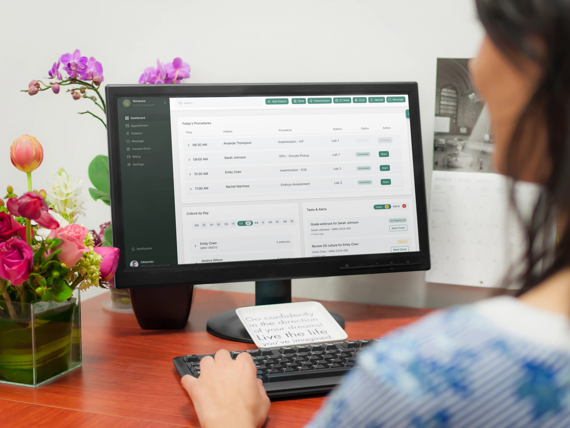
Embryologist Dashboard
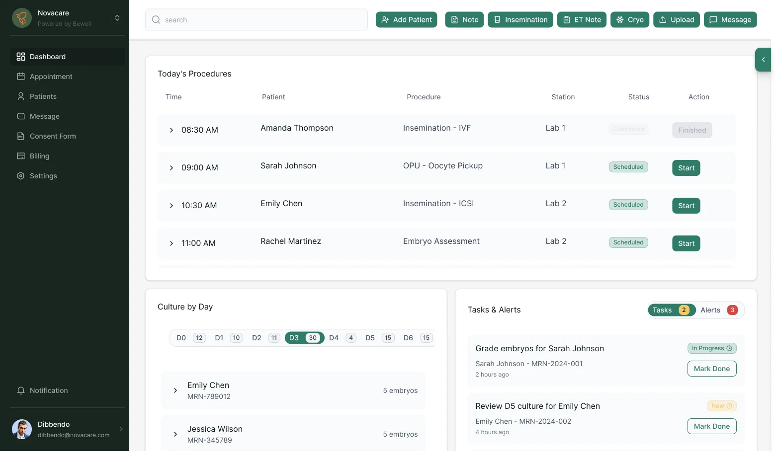
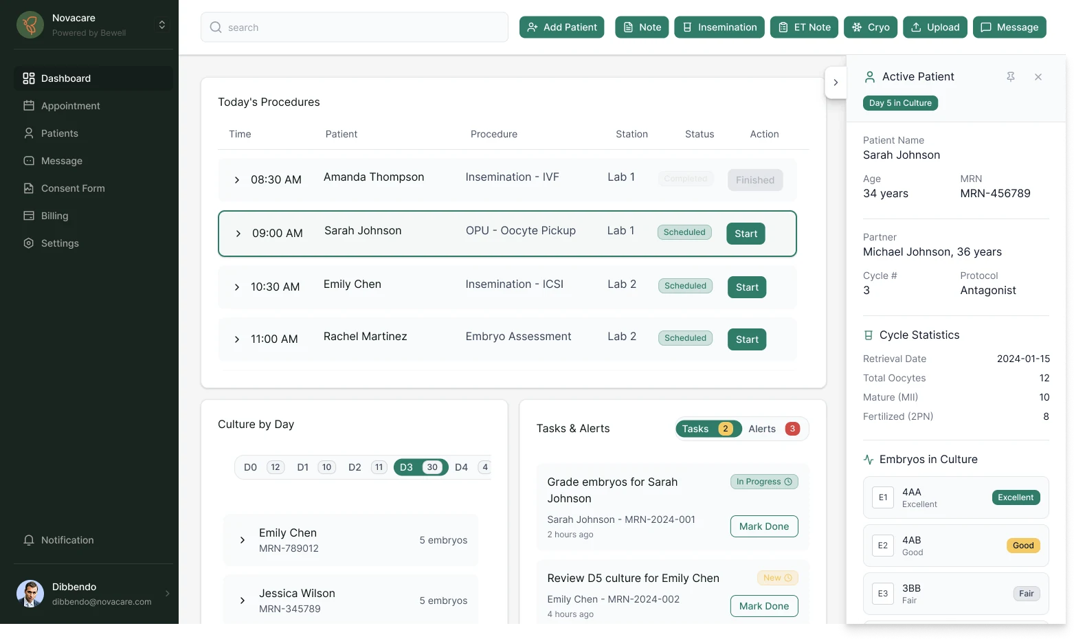
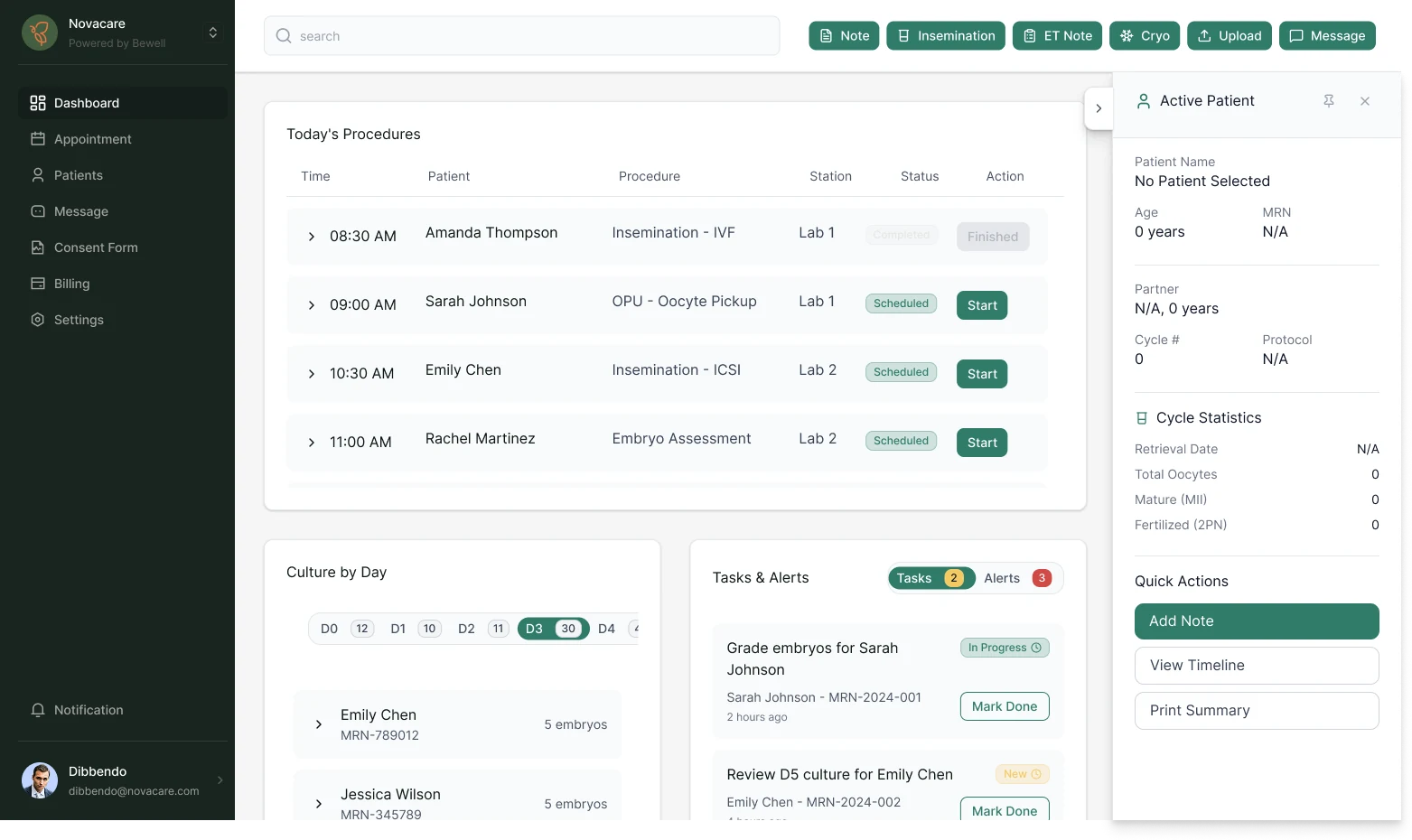
Supporting Dashboard Decisions
One Workspace Instead of Six Modules
Procedures, culture monitoring, tasks and alerts were brought into one view so clinicians could act without repeatedly changing modules.
Keep the Active Patient Visible
The patient panel maintains identity, treatment and chain-of-custody context while staff move through related tasks.
Use Side Panels for Supporting Actions
Secondary tasks open beside the current workspace so users can complete work without losing their place.
Make the Default State Explicit
When no patient is selected, the interface clearly communicates that state to reduce the risk of attaching work to the wrong record.
- Today's Procedures surfaces time-sensitive tasks.
- Culture by Day supports embryo monitoring without extra navigation.
- Tasks and alerts appear inline rather than in separate modules.
- The Active Patient Panel maintains real-time context and chain-of-custody details.
- Actions open in side panels so users maintain their place in the workflow.
Applying the Same Principle to Consent: Keep the Context Together
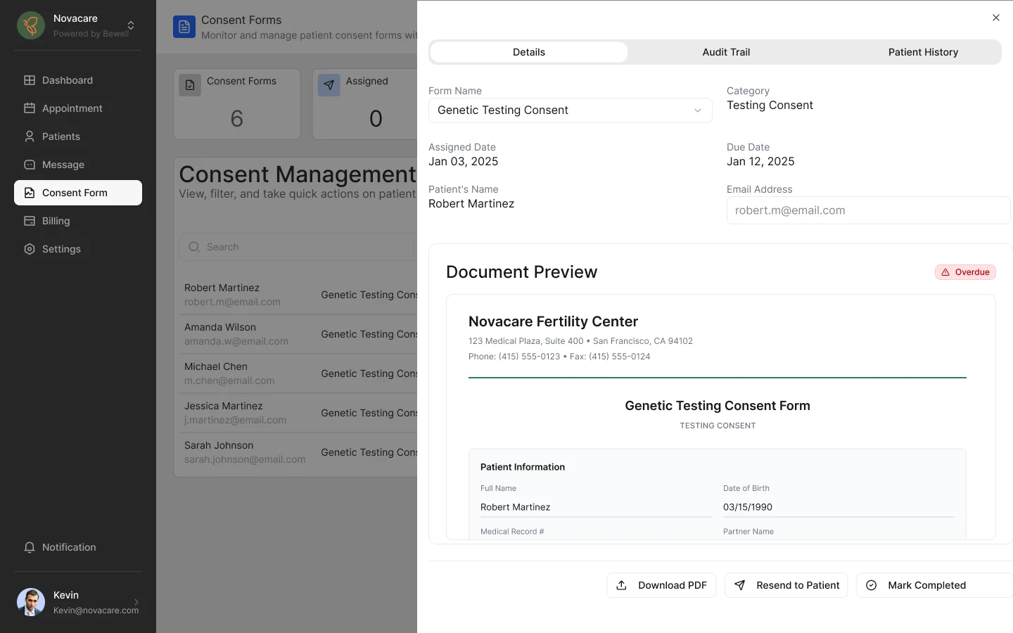
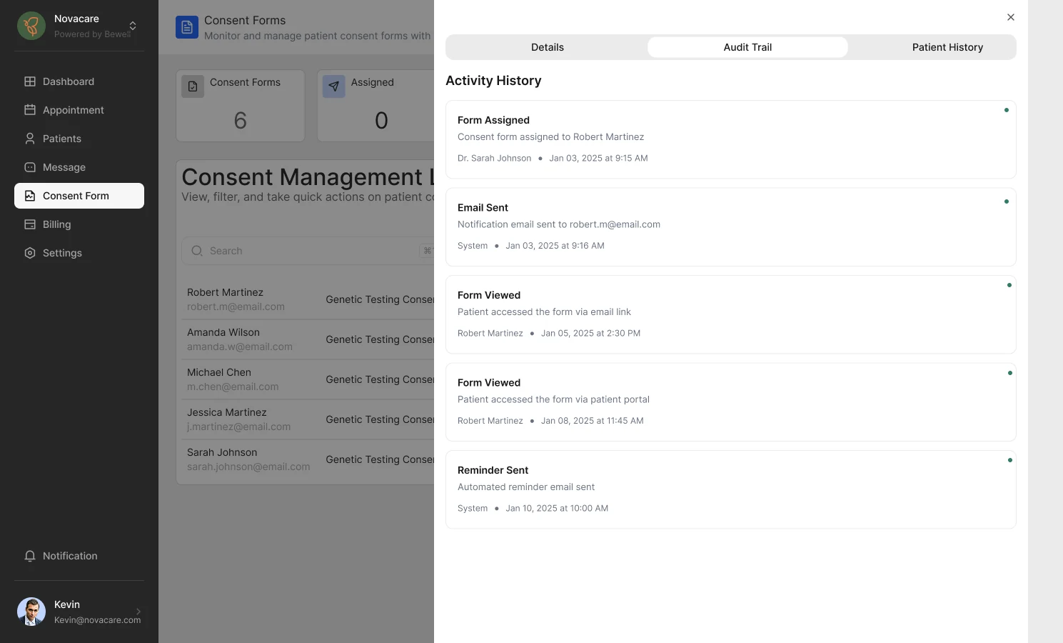
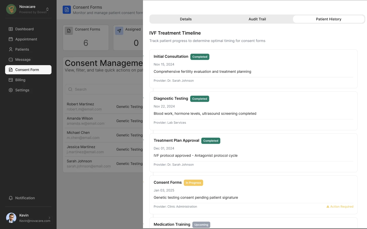
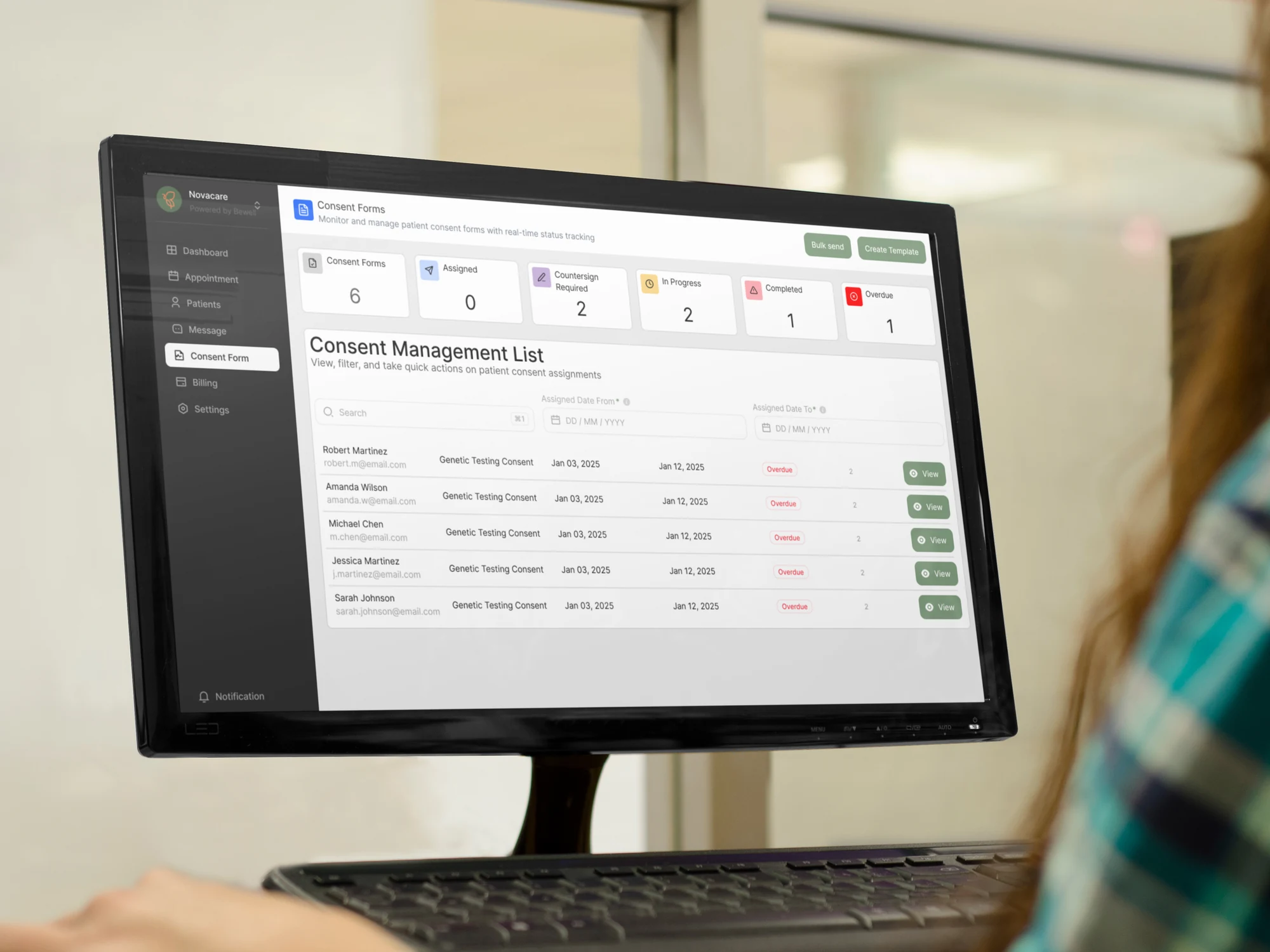
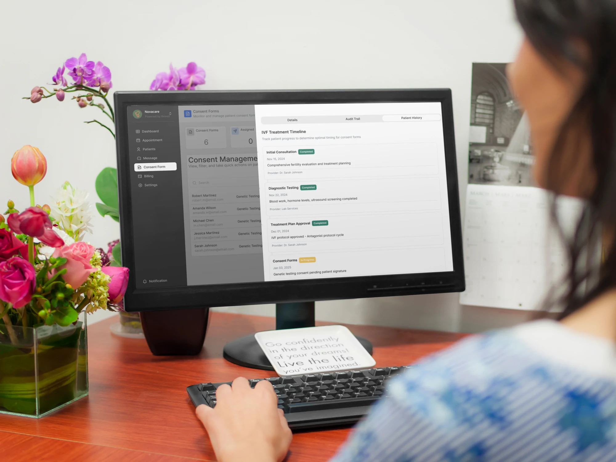
Once the dashboard had established the connected-workspace model, the consent workflow followed the same logic. Status, document details, activity history and treatment context needed to be understandable without forcing teams to reconstruct the story across separate systems.
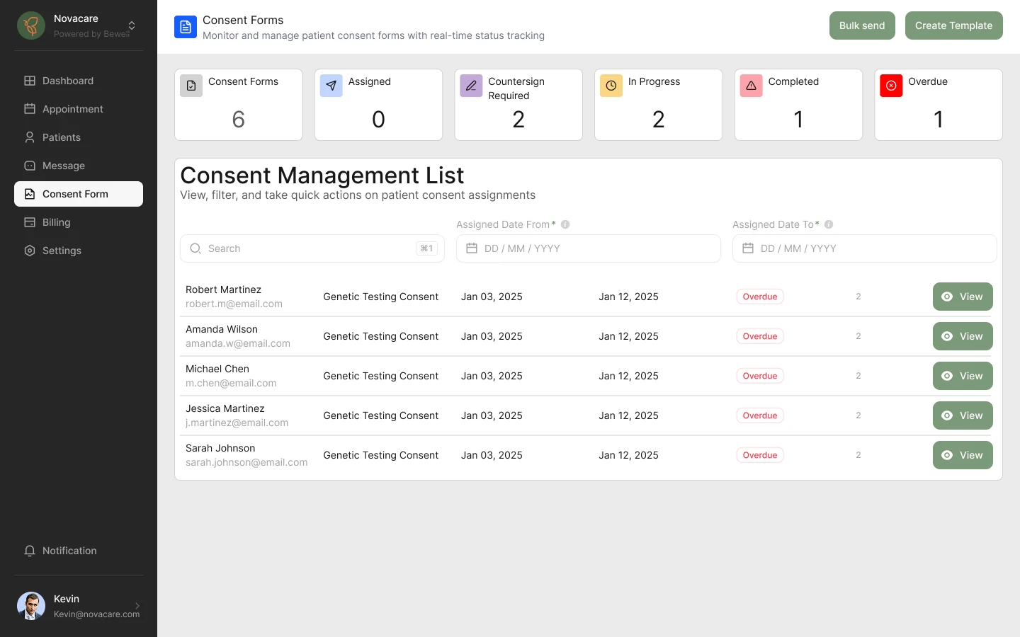
Key Consent Decisions
Keep Status and Actions Together
Consent state, patient information and available actions are shown in one place so users do not have to reconstruct the current situation.
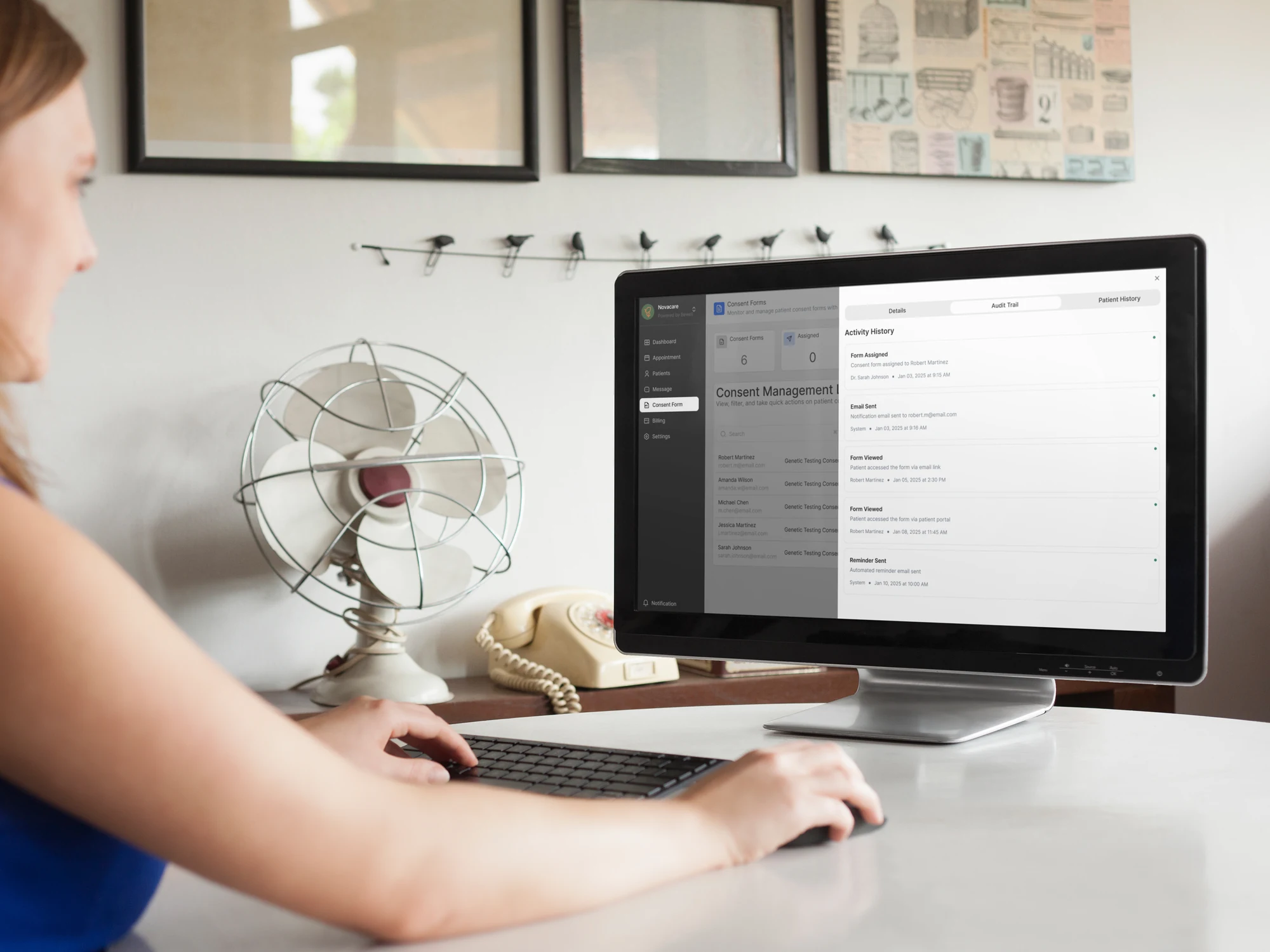
Make the Audit Trail Visible
Activity history remains directly connected to the consent record, improving traceability for clinical, legal and QA teams.
Connect Consent to Treatment Context
The treatment timeline helps staff understand where each consent sits within the wider patient journey.
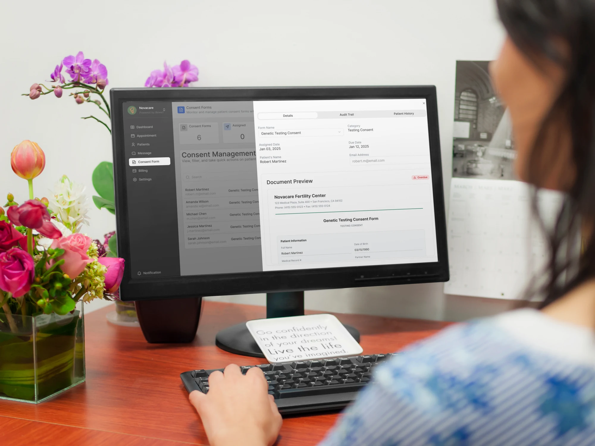
Details View
Patient and form information with status chips and inline actions including download, resend and mark complete.
Audit Trail
A full activity log gives legal, QA and clinical teams clear visibility.
Patient History
Consultations, diagnostics and consents appear within one treatment timeline.
Creating a Calmer Clinical Interface Without Losing Precision
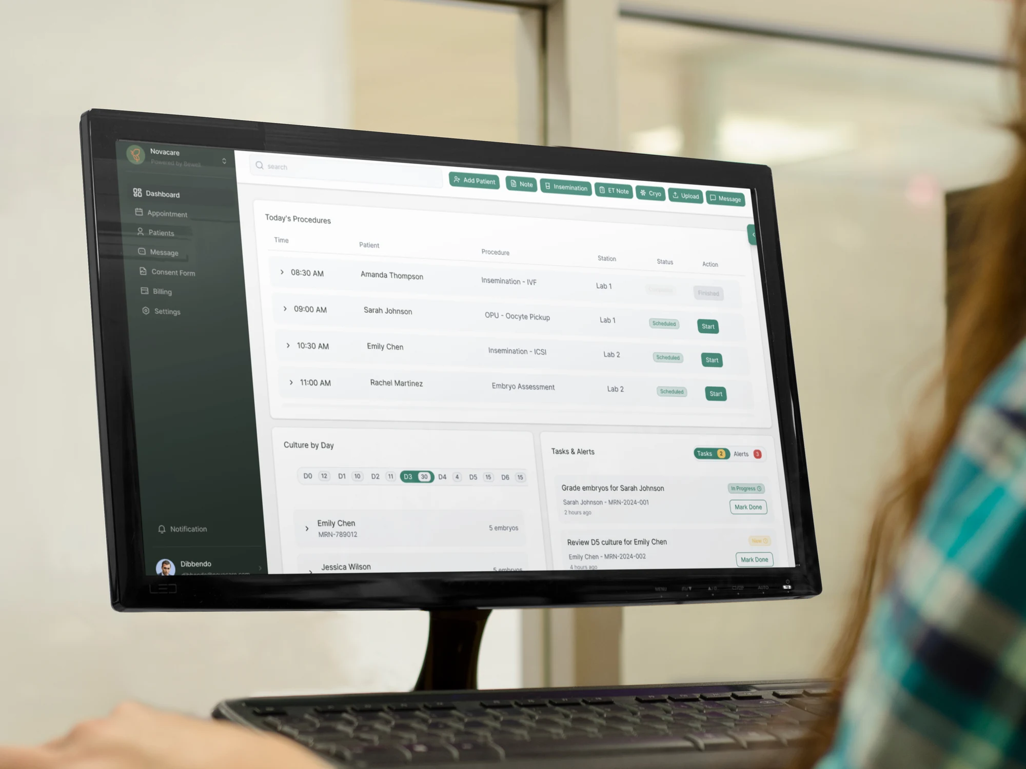
The interaction model solved the workflow first; the visual design then reinforced it. Balanced whites, restrained accents and generous spacing reduce competition between information, while predictable progress states, clear icons and accessible typography support fast scanning in a clinical environment.
The following screens show the dashboard and consent-management experience in the wider clinical context.
The Final Product Removed Work Instead of Simply Digitising It
The final portal brought laboratory work, patient context and consent management into a more connected experience. The strongest improvement was not visual: it was changing the underlying workflow so users no longer had to repeat information the product already knew.
Navigation steps
40% reduction
Task time per patient
30% reduction
Manual data fields
70% reduction
Consent completion
35% increase
“Finally one screen that matches how we work.”Clinician feedback recorded in the original case study
Do Not Digitise a Broken Workflow
Moving a spreadsheet onto screens can preserve the same friction. The product needed to question the process, not just represent it.
Reuse What the System Already Knows
If reliable patient or account information already exists, the interface should surface it and ask for confirmation only where necessary.
Context Reduces Both Effort and Risk
Keeping the active patient, treatment state and related actions visible made the workflow easier to follow without separating safety from usability.
Outcome
The portal turns fragmented laboratory and consent-management work into one connected experience. Clinicians can see what needs attention, maintain patient context, and review the history behind important actions without moving between disconnected systems.
Designing a Complex Healthcare Product?
I help product teams turn complex workflows, sensitive information and operational requirements into clear, accessible digital experiences.
Discuss a Project