Product Comparison Feature
As the sole designer on the Anthesis LCA Calculator project, I tackled the challenge of making complex Life Cycle Assessment data accessible to both technical experts and non-expert clients through an innovative product comparison tool.
Findings
Anthesis needed a product comparison tool that could make Life Cycle Assessment (LCA) data understandable for non-experts while still meeting the expectations of LCA specialists. Existing tools on the market were highly technical, relying on trellis charts and filters that confused many clients.
As the sole designer, I created and tested two design approaches:
- Expert-focused trellis charts with filters
- Simplified box charts with plain-language labels
Usability testing included three LCA experts and two non-expert clients. Results showed that while experts could navigate both formats, clients overwhelmingly preferred the box chart approach, finding it more accessible and less intimidating.
The final design reduced time to interpret results by 33% for non-experts, while maintaining enough depth for experts to drill into detail when needed. By balancing clarity with complexity, the platform opened up LCA insights to a wider audience and delivered on the business goal of creating a tool usable by both specialists and clients without LCA backgrounds.
Helped non-experts find and manage assessments quickly
Reduced interpretation time by 33% for non-experts
Created structured workflow reducing confusion
Both user groups work from same source
TL;DR
Challenge: LCA comparison tools were too technical for non-expert clients. Experts needed advanced filtering, while clients needed simple, clear visualizations to understand environmental trade-offs.
Solution: Created two design approaches and tested them with real users. Box charts with plain-language labels became the primary view, with expert trellis charts available as a secondary option.
Impact: 33% faster interpretation for non-experts, 25% reduction in errors, and both audiences able to use the same platform confidently.
Key Outcomes
Balancing Expert Depth with Client Simplicity
Life Cycle Assessments (LCA) are complex by nature, and existing comparison tools in the market reflected this complexity. Most relied on trellis charts and advanced filters that were designed for experts familiar with technical terms and detailed impact categories.
However, Anthesis' clients often came to the company precisely because they could not use traditional LCA software. They needed results explained in clear, understandable terms, without layers of technical jargon.
This created a design challenge:
- Experts wanted advanced tools: Trellis charts with filters that could drill down into specific impact categories.
- Clients wanted clarity: Visualisations that helped them quickly understand environmental trade-offs without needing technical expertise.
- The business goal: Create a platform that was open to non-LCA experts while still credible enough for specialists.
The tension between these two audiences made it clear that a single design approach would not work. The solution required testing both expert-friendly and client-friendly options to find the right balance.
Understanding Both Audiences
To understand which approach would work for both audiences, I designed and tested two comparison formats:
- Trellis charts with expert filters: Designed for LCA specialists who wanted detailed, category-level analysis and the ability to filter comparisons down to specific impact areas.
- Box charts with simplified labels: Designed for non-experts who need a clearer, high-level comparison without technical jargon.
Testing Approach
I conducted usability testing with:
- Three LCA experts who regularly interpret detailed environmental data
- Two clients without LCA backgrounds who represent the typical end-user Anthesis wanted to reach
Method
- Experts were shown the trellis chart first, then the box chart
- Clients were shown the box chart first, then the trellis chart with filters
Key Findings
- Experts were able to use both formats, but found the trellis charts more aligned with their workflow
- Clients strongly preferred the box charts, reporting that the trellis charts felt overwhelming and full of unfamiliar terms
- Both groups agreed that the box chart design was the clearest overall, while still giving enough insight to make informed decisions
Client-First with Expert Depth
Based on testing results, I prioritised the box chart design while ensuring the system still provided enough depth for expert users. The approach focused on three core principles:
Clarity for Non-Experts
Simplified labels and plain-language descriptions replaced technical terminology
Depth for Experts
Advanced data available in supporting views rather than primary chart
Flexible Workflows
Dashboard with assessment cards for quick access and comparison portfolios
By combining a client-first visualisation with optional expert detail, the platform achieved the business goal of making LCA accessible to a wider audience while maintaining credibility with specialists.
Designed for Both Audiences
The final design balanced simplicity for clients with enough depth for expert users. Key screens included:
User Flow
The user journey was designed to guide users through a structured workflow from initial assessment selection through the complete product lifecycle analysis. This flow accommodated both quick comparisons and detailed lifecycle stage breakdowns.
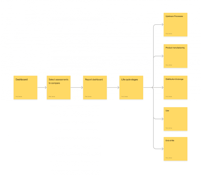
Complete user flow for the LCA product comparison feature, from dashboard to detailed lifecycle analysis
LCA Dashboard
Goal: Provide an overview of all assessments in one place.
Solution: A card-based dashboard where each assessment showed a title, category, and quick visual identity.
Impact: Helped non-experts find and manage their assessments quickly without needing to navigate complex menus.
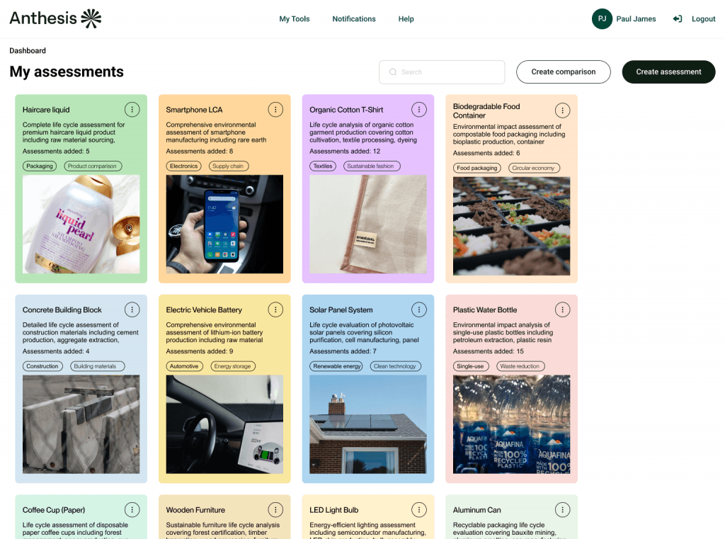
Dashboard view displaying all assessments in an organized card layout with visual categorization
Comparison Portfolio
Goal: Allow users to compare multiple products and generate shareable reports.
Solution: A guided form for selecting benchmarks and assessments, naming comparisons, and adding descriptions.
Impact: Created a structured workflow that reduced confusion and ensured results could be reused across projects.
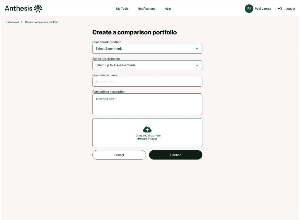
Guided form for creating comparison portfolios with structured input fields and clear workflow
Product Comparison
Goal: Make environmental trade-offs easy to understand for clients without LCA expertise.
Solution: Box charts displayed product impacts across categories in a clear better–worse format, with high contrast colour coding and plain-language labels.
Impact: Reduced interpretation time by 33% for non-experts in testing.
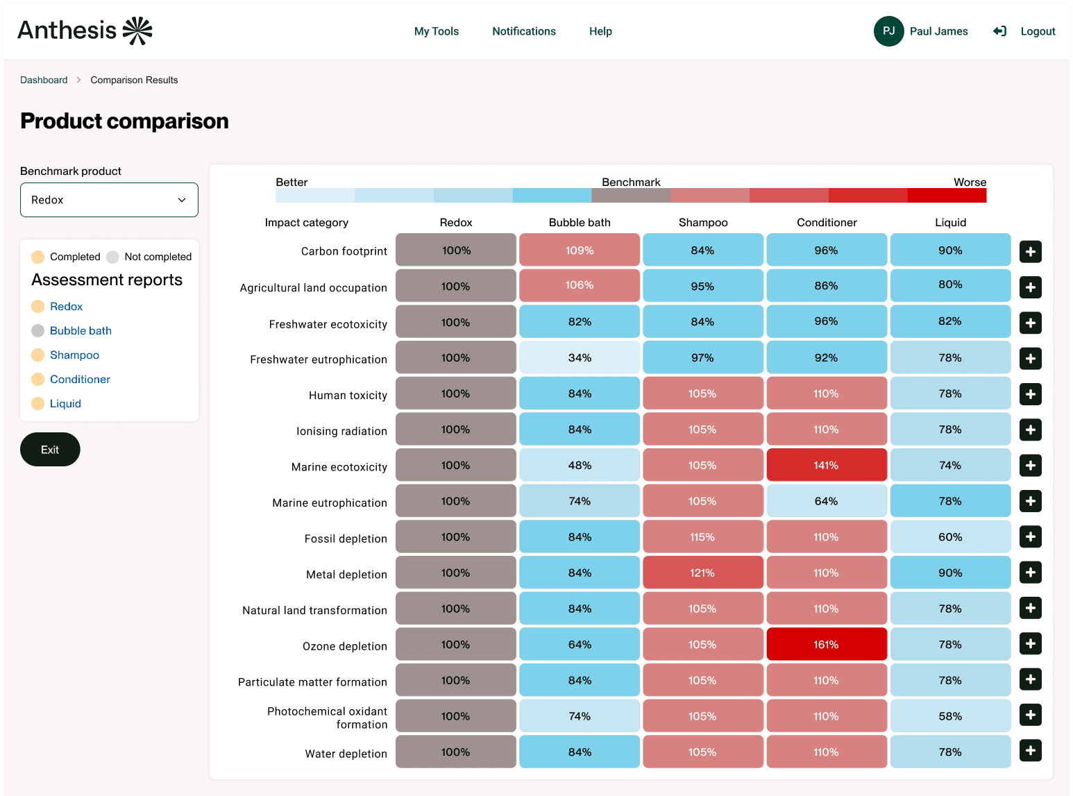
Complete product comparison view with color-coded environmental impact indicators across multiple categories
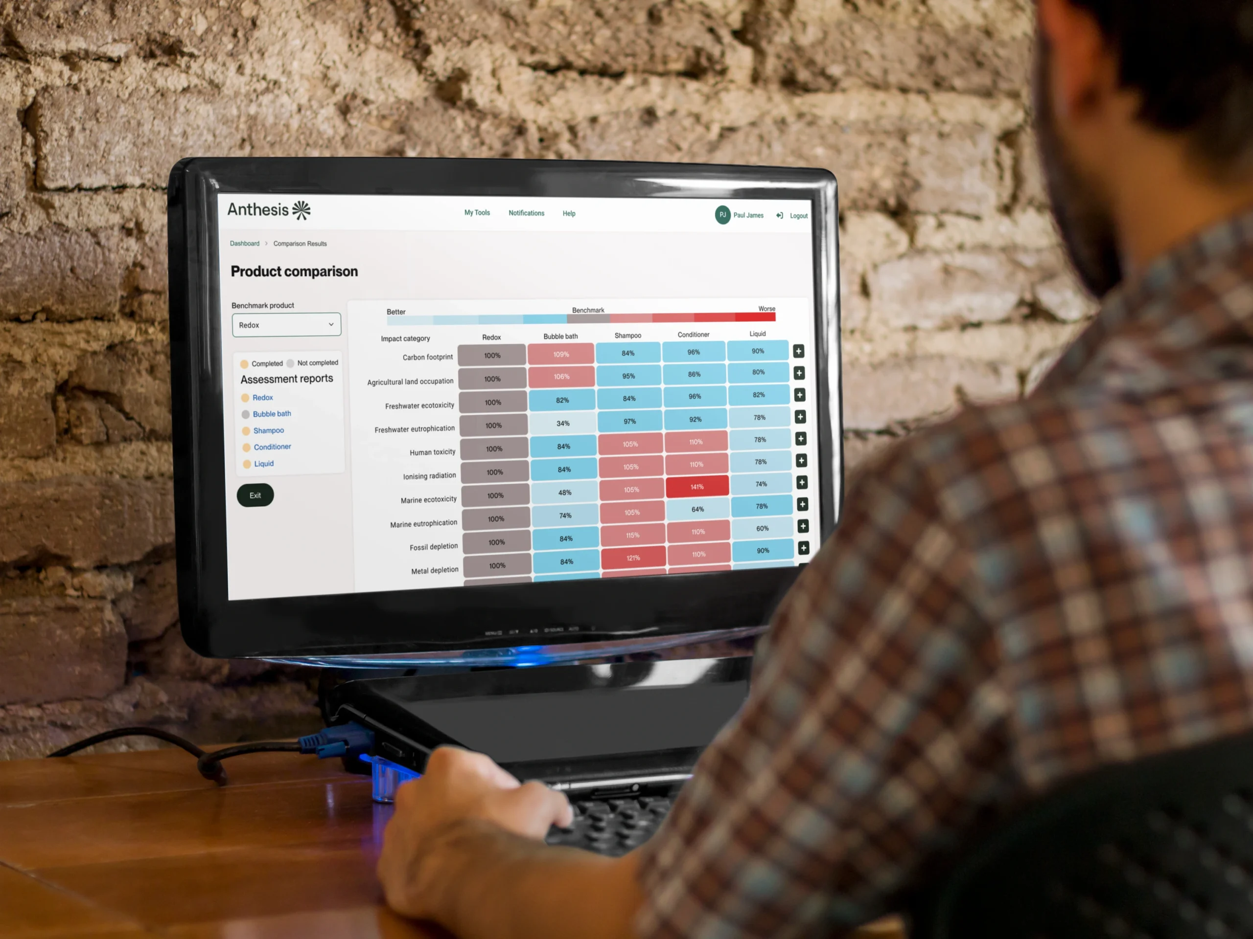
The product comparison tool in use, demonstrating the clean interface in a real-world consulting scenario
Delivering Value to Both Audiences
The final design delivered clear improvements for both clients and experts while aligning with the business goal of making LCA accessible to a wider audience:
Clarity for clients
Box charts reduced interpretation time by 33% and eliminated confusion around technical terminology
Efficiency for experts
Trellis charts and filters still available in supporting views for deeper analysis
Error reduction
Guided workflows and simplified reports reduced mistakes and incomplete comparisons by 25%
Stronger client confidence
Non-experts reported they could understand results independently
Business alignment
Platform achieved goal of being usable by both audiences, opening insights to clients who struggled with market tools
By prioritising box charts as the default and positioning expert tools as secondary, the design struck the balance needed to serve both groups effectively.
Key Takeaways
This project highlighted the challenge of designing for two very different audiences: technical experts and non-expert clients. A few key takeaways:
User testing is essential
Without testing both trellis charts and box charts with real users, assumptions from the business and experts could have led to a solution that excluded clients.
Clarity should take priority
Experts can adapt to simpler visualisations, but non-experts will disengage if data feels too technical.
Accessibility extends beyond compliance
Using plain language and intuitive visual formats made the tool more approachable, not just more compliant.
Balance builds adoption
Providing expert-level depth as a secondary option meant both groups could rely on the same platform rather than needing separate tools.
Overall, this project showed how thoughtful UX can make specialist insights accessible to a broader audience, helping Anthesis deliver value to clients who had struggled with traditional LCA software.