On this page
01 · Overview
Redesigning a complex financial platform as one connected product
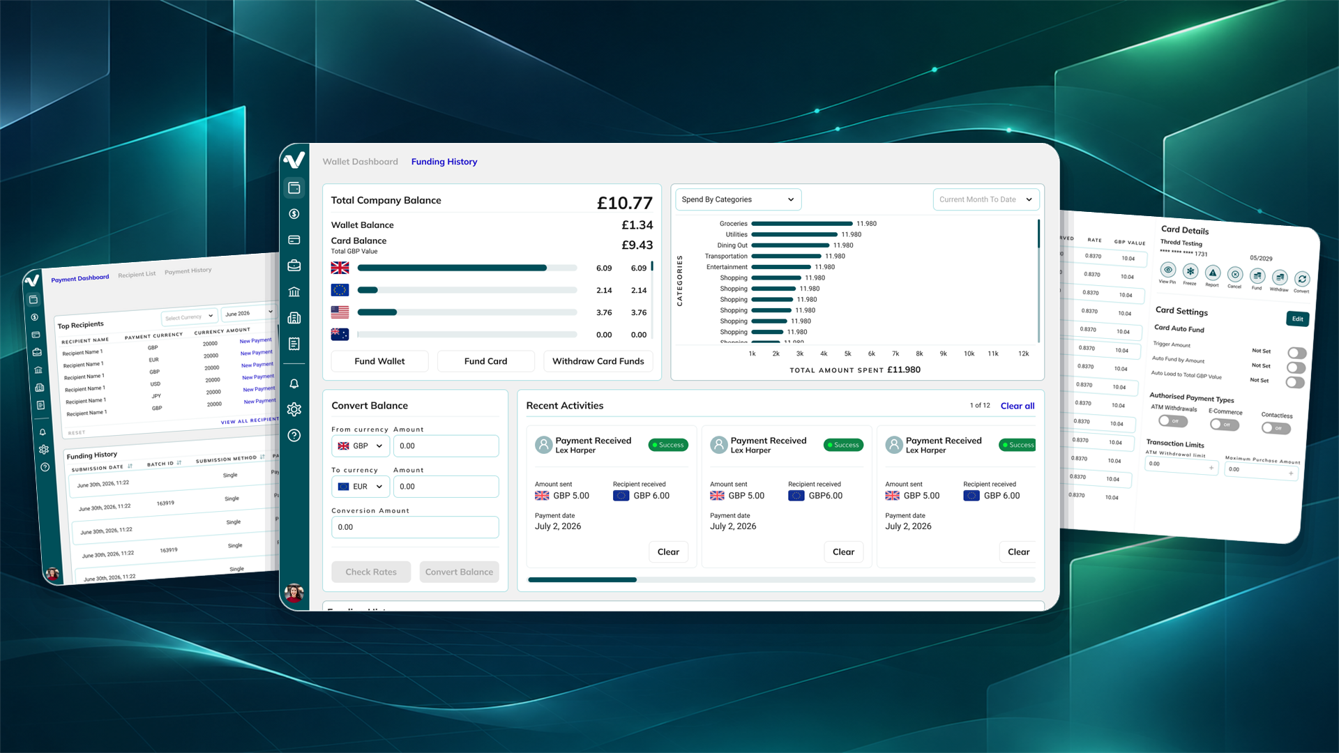
Volopa is a financial SaaS platform supporting business payments, multi-currency wallets, prepaid cards, expenses, collections and accounting workflows. The existing product had grown into a capable but fragmented experience, with important destinations and actions spread across different navigation patterns and standalone pages.
My role was to create a clearer structure without losing the breadth of the platform. The redesign progressed through three connected phases: restructuring navigation, consolidating workflows and introducing contextual side panels for supporting actions.
02 · The challenge
The platform worked, but it did not feel like one system
Primary navigation was split between a top navigation bar and a nine-dot menu. Related journeys could move users between different areas of the product. Funding a card, for example, redirected people to the Wallet page rather than keeping the task in the context of the card they were managing.
As the platform expanded, information architecture and interaction patterns became less consistent. Tables, filters, actions and page layouts behaved differently across areas. This increased the amount users had to relearn and made common workflows feel more complicated than the underlying business task.
The core problem was not a lack of functionality. It was fragmentation across navigation, page structure and task context.
The redesign needed to improve clarity while respecting business requirements, compliance considerations, existing Ant Design foundations and the practical constraints of an active development roadmap.
03 · Research & role
Using evidence and collaboration to make design decisions
As the sole designer, I worked across UX research, information architecture, user flows, wireframes, interface design, interactive prototyping, design-system development and developer handoff. I collaborated with the head of department and internal colleagues who represented business, client and compliance needs.
Requirements and feedback came through the internal team, allowing design decisions to be reviewed against operational knowledge and client expectations. I worked approximately three to four sprints ahead of development so that major journeys could be explored and resolved before implementation began.
A repeatable decision framework
I documented each significant design problem using a consistent framework: Problem, Evidence, Options, Trade-offs, Decision, Expected improvement and Team feedback. This made the reasoning visible and helped discussion focus on the user and business consequences of each option.
Problem & evidence
Define the workflow issue and collect the product, stakeholder and client evidence behind it.
Options & trade-offs
Compare alternative structures against usability, scalability, business rules and delivery constraints.
Decision & feedback
Document the chosen direction, the expected improvement and how the team responded.
Evidence boundary: The platform has not been publicly released, so this case study does not claim post-launch improvements in task time, conversion, error rate or support volume.
04 · Architecture & user flow
Mapping the complete platform before changing individual screens
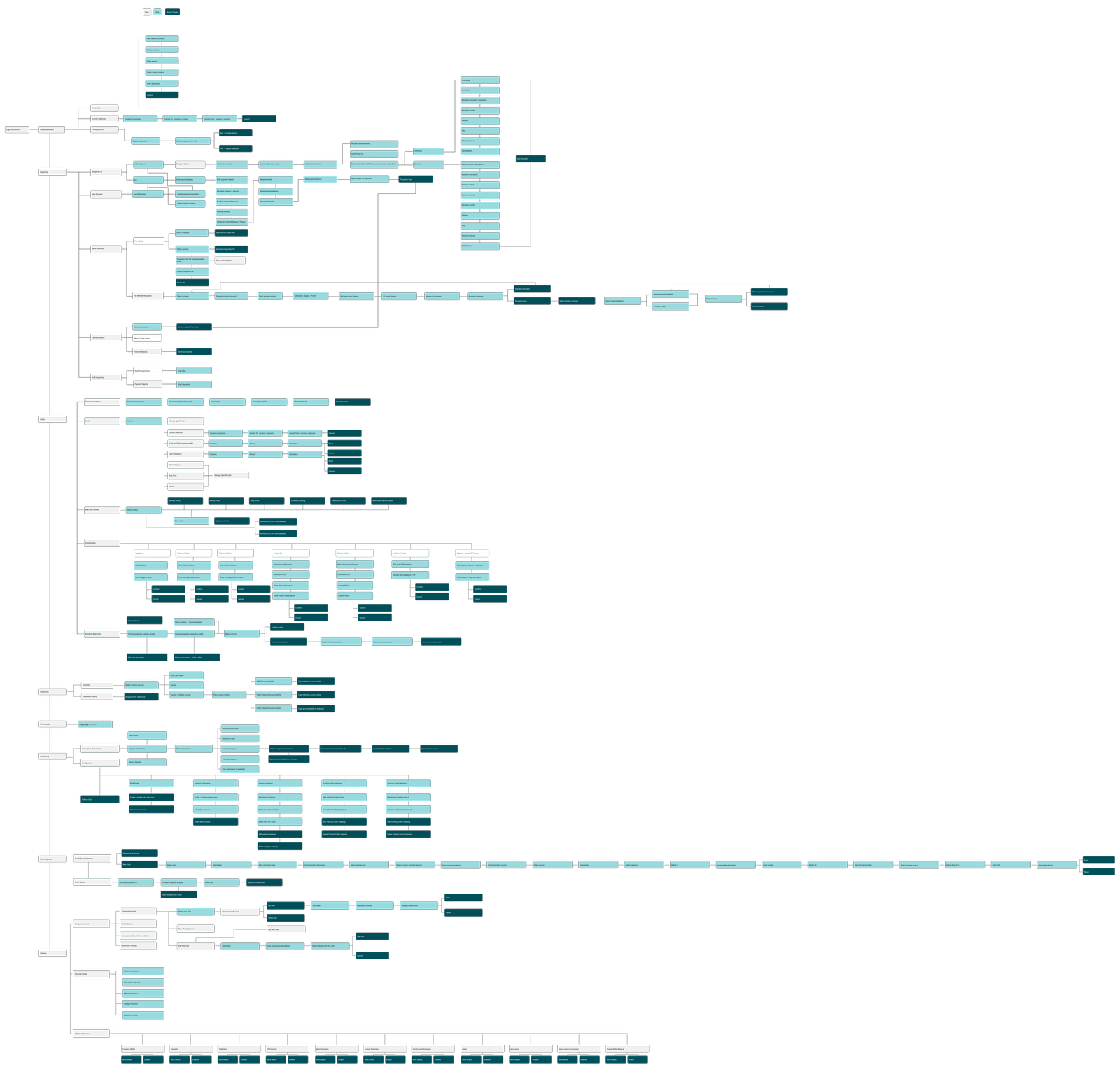
The platform supported a wide range of journeys across wallets, payments, cards, expenses, collections, accounting, company settings and additional services. I mapped the complete structure to understand how these destinations connected and where users were being moved away from the task they had started.
The flow became a shared reference for restructuring the information architecture and checking that new patterns could scale across the wider platform rather than solving one page in isolation.
05 · Phase 1
Creating a clearer navigation hierarchy
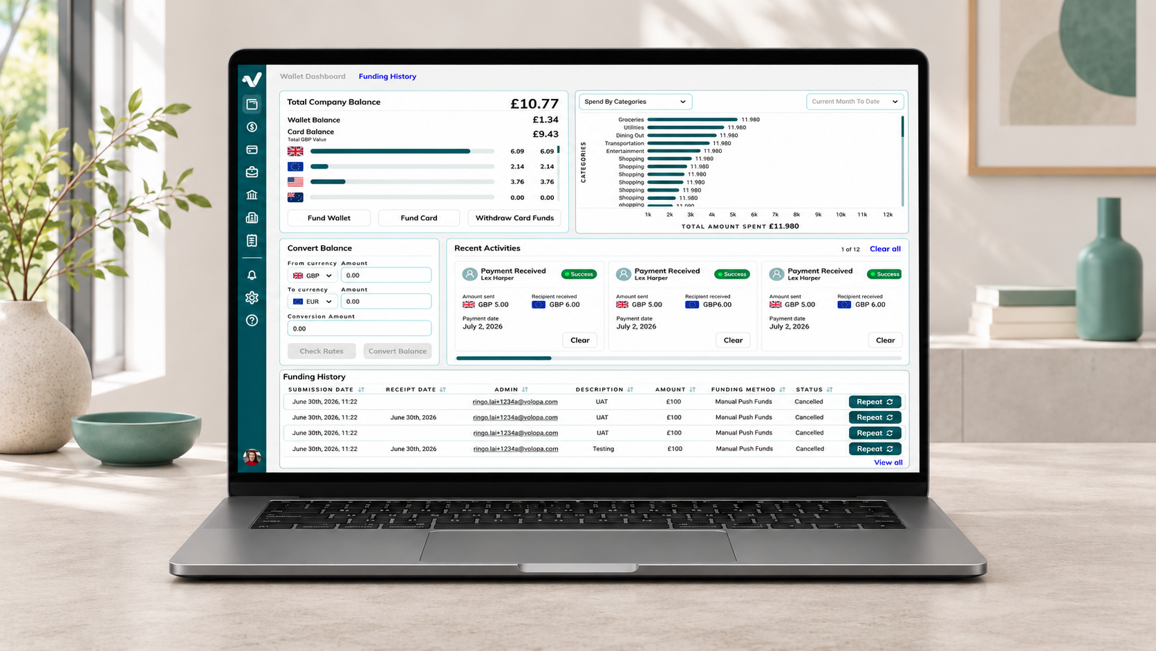
The first phase focused on the platform’s overall structure. I introduced a persistent left sidebar for primary destinations, giving users a stable view of the main product areas. The top navigation was retained for section-level secondary navigation, so it supported the current destination rather than competing with it.
This established a clearer hierarchy between global navigation and local choices. It also created a framework that could accommodate the platform’s breadth without relying on the nine-dot menu as the main route into important functionality.
BeforePrimary destinations were divided between top navigation and a nine-dot menu.
AfterA persistent sidebar holds primary destinations, while the top navigation supports the current section.
06 · Phase 2
Consolidating pages around the work users were doing
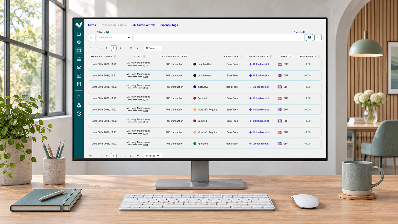
The second phase addressed workflows that had been divided across standalone pages or disconnected actions. I consolidated related tasks, refined tables, filters, rows and columns, and reduced the need to leave the current area for supporting actions.
Transaction review and approval was redesigned as a connected workflow. Employees could attach a receipt or explain why one was missing, and the company could review and approve the transaction with the relevant information kept together.
The aim was to reduce the number of separate contexts users had to understand, while preserving the controls needed for financial oversight.
07 · Phase 3
Keeping supporting actions in context with side panels
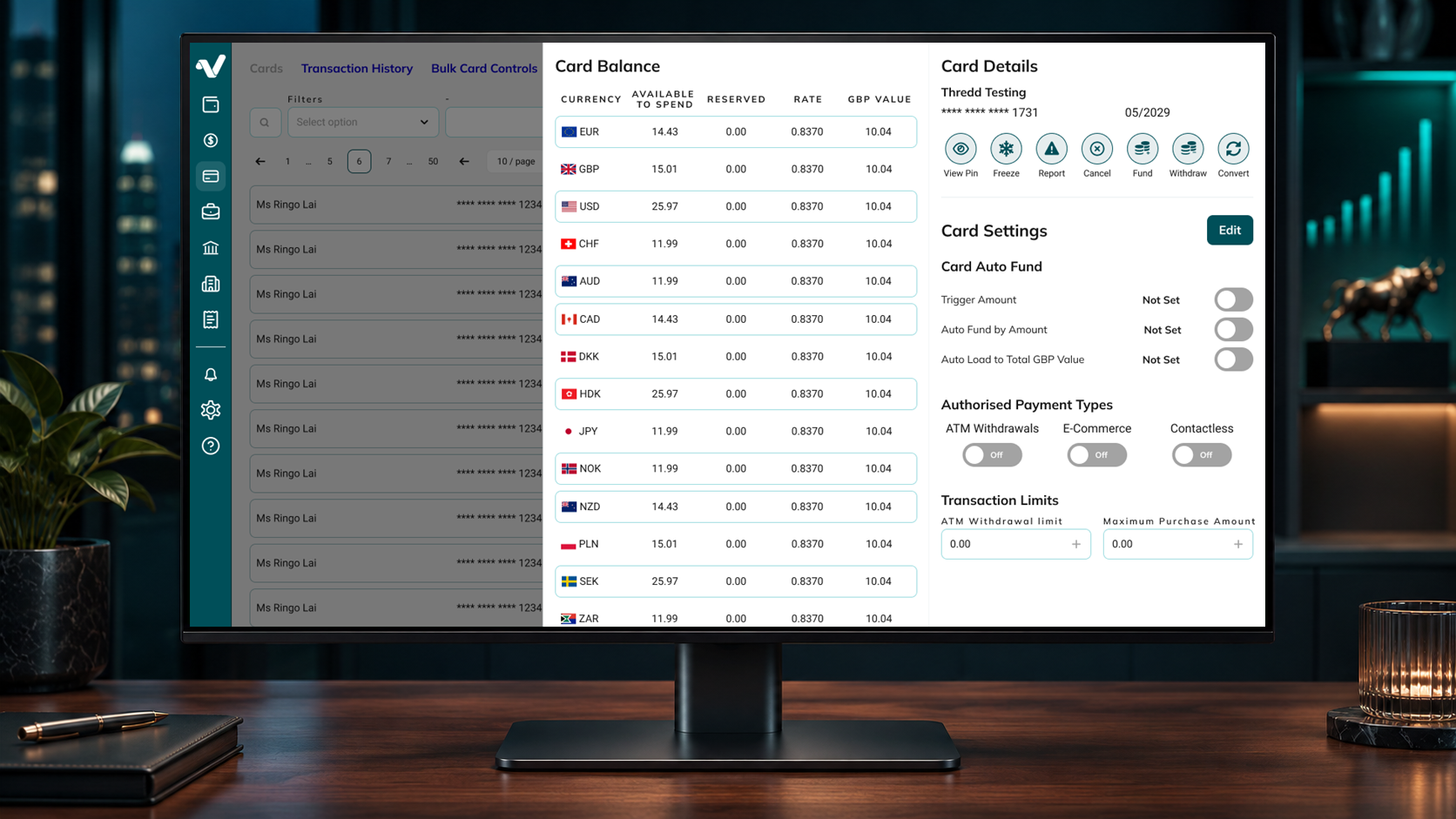
The third phase introduced contextual side panels for tasks that needed more detail without requiring users to leave a table or lose their filters and position. I evaluated expandable rows as an alternative, but they became difficult to scale across complex data and would have added implementation overhead.
Side panels provided a reusable pattern for transaction review, bulk card controls, multi-card withdrawal and accounting workflows. The underlying table remained visible, so users retained the context of the list they were working through.
An important edge case emerged in multi-card actions: selecting a currency on one card must not change the same currency on another card. The interaction and state model were designed so each card retained its own independent selection.
Bringing useful analysis into the dashboard
The redesigned dashboard introduced clearer views of top card users, spending over time, tracking codes and categories. These views were intended to help administrators understand activity without moving through several separate reporting areas.
The design does not claim a measured reduction in support demand. The platform is still in development, and any production impact would need to be evaluated after release.
08 · Design system & prototype
Building a reusable foundation alongside the product
The platform was based on Ant Design, but there was no complete Figma system or semantic token structure for the product. I created variables and tokens for light and dark modes, documented reusable components and updated selected older Ant Design patterns where the product needed a clearer or more current solution.
The system was reused by internal teams, helping the redesign extend beyond individual screens. Figma MCP connected component information, Ant Design documentation and design tokens, making implementation references easier to access during development.
Testing connected journeys, not isolated screens
I used Figma Make and Codex to build a connected interactive prototype. Its purpose was to test structure, navigation and workflow behaviour across the platform, not to create a production application.
The prototype and documented decisions gave stakeholders and developers a shared way to review how the platform should behave before each area moved into implementation.
09 · Outcome
A scalable direction for a platform still moving through development
The completed designs replace a fragmented collection of routes and page patterns with a clearer navigation model, more connected workflows and reusable contextual interactions. The work has been handed over, selected functionality has been implemented in staging and development continues.
Stakeholder response was positive, and one of Volopa’s largest clients was very happy with the direction presented. The design system has also been reused internally, extending the value of the work beyond the individual case-study screens.
The redesigned platform is not yet publicly released, so no production performance metrics are reported.
10 · What I learned
Scalability depends on structure as much as interface design
This project reinforced the importance of treating information architecture, interaction patterns and design-system decisions as one connected problem. A screen can look clear in isolation and still create friction if the surrounding navigation or workflow moves users away from their task.
It also showed the value of recording trade-offs. The decision framework made it easier to compare options, explain why a pattern was chosen and keep design discussions connected to evidence rather than preference.
The result is a stronger foundation for Volopa’s web platform: one designed to support current workflows while remaining flexible enough for new financial products and operational requirements.